This week I’m getting back to talking about game design and I’m going to tell you about a fairly major battle feature that we haven’t discussed yet: attachments.
Card games like Magic: The Gathering and most variants of it are largely about building up a board position by summoning creatures or other persistent entities to your side. Usually they mix in a bunch of throw-away attacks too – cards that you play to do damage or otherwise change the board position but which don’t hang around.
Card Hunter is a game where your characters start on the board and, as yet, we don’t have the concept of summoning more creatures to the battle. Most of the cards are attacks, defences or movement, so they are inherently transient in nature. That means you don’t tend to have a build up of power or an increase in the complexity of the board state over time. That’s not necessarily a bad thing. However, we did want to include an element of persistence to the battle and there are naturally some battle elements that seem to demand state. For example – stunning someone, setting them on fire and so on.
Some of these can be handled through our existing game state. So, for example, confusing someone could be handled by forcing them to discard cards, mimicking their loss of possible actions. Stunning could be handled in a similar way. But, after a while, you start reaching for ways to handle these more complex states.
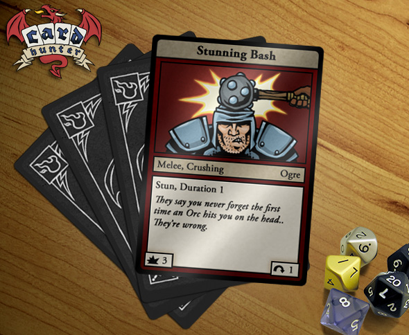
Anyway, to cut a long story short, the way we handle this is by “attaching” cards to things. These attached cards hang around and exert ongoing effects. It’s very much like an enchantment in Magic. We’ve already seen some simple examples, so here’s one we already showed:
What does Stun actually mean? The full rules text for that keyword is: “Attach this card to the target. Target can only play Move cards”. Duration one means that card stays attached for one round (attachment durations are checked at the start of the round, so if you play it in the middle of a round, your target will be stunned for the rest of that round and then the card will be discarded at the start of the next).
What’s nice about this system is that there’s no special Stun state. Stun is defined by a card, so we can introduce new states for characters just by writing out the rules for those states on the cards. For example: poison, burning, encumbered, slowed are all states implemented through card attachments.
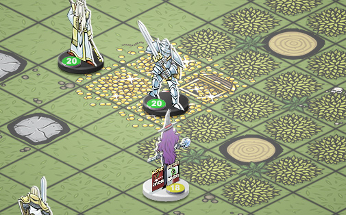
What do attached cards look like in the game? They’re tiny little copies of the card stuck to the figure. You can mouse over them to read the card. It looks a bit like this:
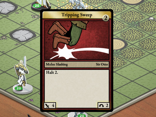
You can see two cards attached to the female wizard with the purple hair. Yeah, they’re a bit tiny to read but you can just mouse over them and zoom in on them like this:
Now you can see that this particular attachment is a Tripping Sweep card which halts it’s target for two turns. Halt, as you might expect, prevents you from playing any move cards while the card is attached. The little gold counter in the top right of the card shows that it’s going to remain attached for another two rounds. So that wizard isn’t going anywhere for a while.
Pretty simple eh? There are some additional rules for cards like Fireball that attach to multiple targets (it explodes and causes burning in a 3×3 area). To deal with that we create temporary copies of the original card.
Next week I’ll talk about terrain attachments!


January 26th, 2012 at 10:59 pm
Nice, i was curious how status ailments would be handled. This seems like a terrific system!
January 26th, 2012 at 11:33 pm
While I love your “sticking to the card system” with every feature, this just seems its gonna be harder to visualize what’s going on than if just effects were attached to things…
January 27th, 2012 at 3:54 am
@Woitee – it is a bit harder to visualise, but it means we can have arbitrary states instead of having to stick to a few basic ones. Some of the attachments we have are pretty wacky.
January 27th, 2012 at 6:01 pm
Are there plans to have more verbose descriptions of these character states, perhaps displayed on mouseover or click? While not acting or not moving are pretty easy to remember, “Burning 3 – Duration 3″ or “Poisoned 5″ might not offer a great deal of clarity – especially for newcomers.
January 28th, 2012 at 12:24 am
@Krymson, yes, we plan to have mouse-over explanations of all keywords.
January 28th, 2012 at 7:13 pm
@Jon – Oh yeah, thats actually a really good point. And considering how MtG is played, players will get used to this in a short while. Nothing but great work so far, keep it up 😉
January 29th, 2012 at 11:26 am
I cannot wait any longer! LEMME AT ‘EM.
January 31st, 2012 at 3:25 pm
One question, not about the system. (Wich also is looking very neat!)
Im wondering about the beta, Will the readers of this blogg (We) get the keys before others that isnt following it?
January 31st, 2012 at 3:31 pm
I think this is an excellent idea.
January 31st, 2012 at 9:41 pm
@Jointelid: I don’t really know, but it seems like a good bet!
February 13th, 2012 at 4:33 pm
It seems like attaching the entire card would be a bit “noisy” since that card may have a lot of other info besides the effect that gets put on the card. In terms of UI it seems like highlighting the relevant part, and/or dimming the rest of the card, would be good to streamline the user’s attention and clarify which part of these cards they care about.
Personally I think I would have gone with a mix: there are certain standard “status cards” that get attached and are recognized instantly (play a card “attach an ‘on fire’ card to target enemy” – the standard “On Fire” card appears on that enemy), and a few special-case cards that attach themselves and have special text.
But I can see why you’d want to go with just one of those two options rather than mixing; and if you have to choose between them, this does seem like the more robust and interesting way to go.