I promised I would explain Skills and Talents. Then I explained Skills but not Talents! Now, I’m here to fix that. In the process I’ll show you a lot more about deck building in Card Hunter.
You might also recall that a while back I had a bit of a rant about how hard it is to do both single and multi-player in a single game, even though that is one of the major goals for us in Card Hunter. At the end of that diary I hinted about a system we were working on that accommodated both single and multi-player deck building. Well, that system is the talent system.
In the comment thread to that blog post Umberto Pignatelli wrote:
A suggestion. What about instead dividing the items in broad “levels”, let say Weak, Average, Strong
And then have players build their characters with 2 Weak, 2 Average and 2 Strong (on any combination)? You can always substitute a stronger item for a weaker one (so picking up 3 Weak instead than 2 Weak and 2 Average).
A prescient suggestion! Change the names and that’s pretty much the talent system. Instead of having traditional RPG style level caps on items in single-player and a separate point system for multi-player, this type of system allows to use the same constraints in both multi and single-player.
Our talents are divided into levels which we just refer to by colour:
- Clear
- Bronze
- Silver
- Gold
In single-player, your character gains talents as they level up. At the start of the game, you have no talents, which means that you can only use items that don’t have any talent requirements (there are still plenty of these though). As you level up, you’ll eventually get your first clear talent. This allows you to use one item that requires a single clear talent to use. You can see where it goes from there.
In balanced multi-player we just pick a standard level and give you the talents that you’d have at that level.
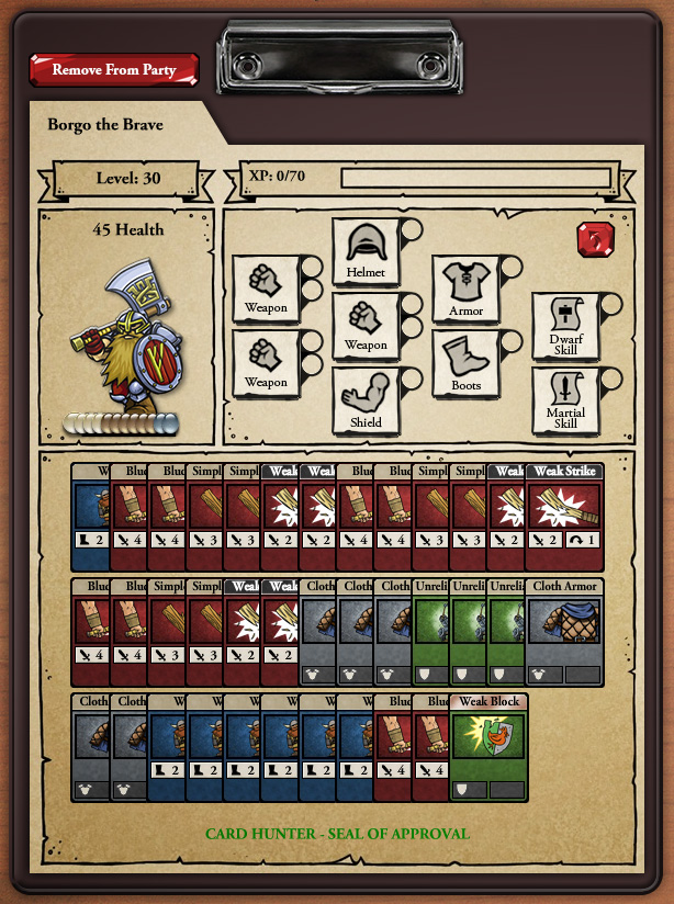
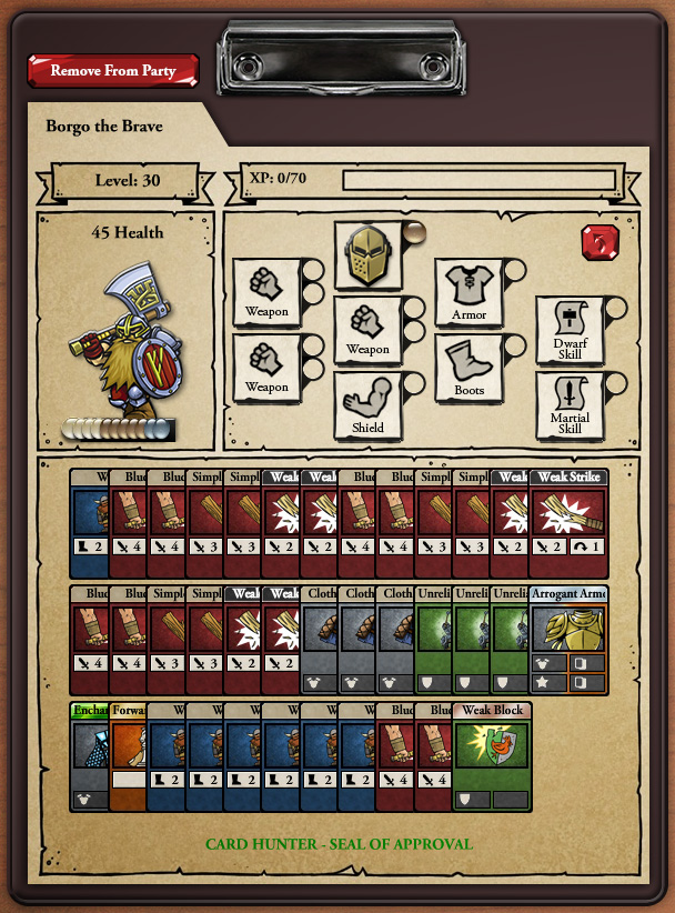
Let’s look at an actual example. This is the character sheet for Borgo the Brave, a 30th level dwarven warrior:
OK, what’s going on here? Borgo’s talent pool (i.e. all the talents his available to spend) is directly below his portrait. You can see that he has four clear, six bronze and three silver talents, each represented by a coloured glass bead.
Borgo isn’t currently carrying any items so all his item slots are empty. You can see he has the following open:
- Three weapons.
- One heavy armor.
- A helmet.
- A shield.
- Boots.
- A dwarf skill.
- A martial skill.
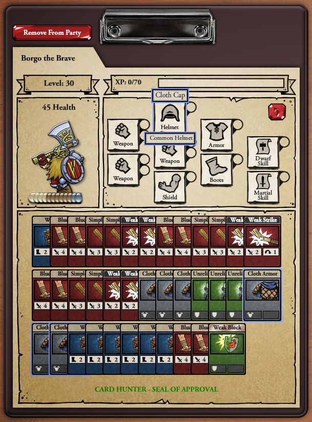
Because those slots are unfilled, his deck is full of pretty rubbish cards like Walk and Weak Strike. In the deck builder, if you mouse over a slot, it shows you which cards are put into your deck from it. For example, if you mouse over the Helmet slot you see the default “Cloth Cap”.
From that default item you get three Cloth Armor cards. Woopee!
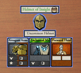
Let’s look at the process of putting a better item into that slot. For example, something like this:
That’s more like it. The Helmet of Insight is a pretty powerful item requiring a bronze talent which you can see directly next to its name. Let’s see what it looks like when we equip that item:
Note a couple of things here. Firstly, one bronze talent has moved from our talent pool to the little slot next to the helmet, showing it is being used to equip that item. Secondly, we now have replaced those Cloth Armor cards with Arrogant Armor, Enchanted Mail and Forward Thinking in our deck giving us a great deal more protection (and power).
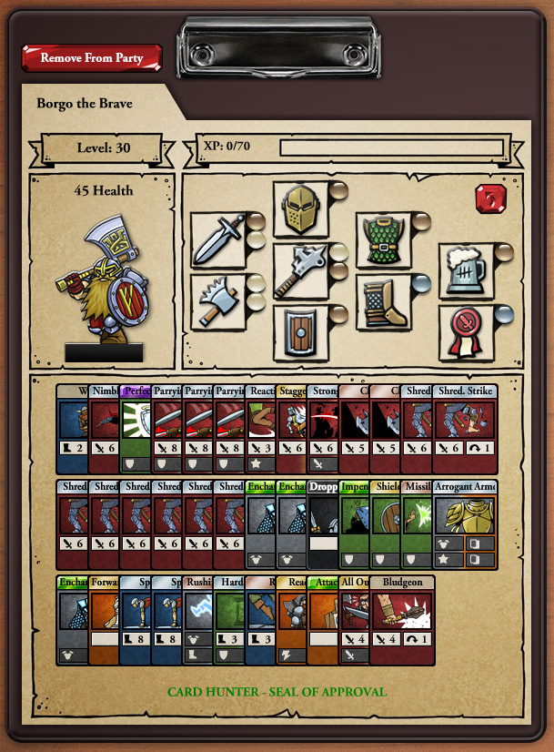
Let’s see what Borgo looks like when he is fully kitted out:
Our talent pool is now empty and all those little beads are being used to equip various items. Our deck is full of powerful cards and we’re ready to adventure!
So, that’s the talent system (and a quick look at deck building). What took us so long to implement this system, as opposed to the level cap and skill point system I talked about before? Well, it required a fair amount of thinking and experimentation to settle on the talent bead metaphor. It was important to us that the UI communicate what was going on in a simple and intuitive way and we think we’ve finally cracked that nut. When you equip an item the little beads fly around and rearrange themselves as necessary. It’s very clear when you have enough and when you don’t.
The other thing we had to figure out was how to handle weapons and other items that require two beads. Weapons put six cards into your deck, as opposed to the three that come from other types of items so they generally require two talents to equip instead of one. The bead metaphor provided a simple way of showing that too.
So, we’re pretty happy with this system. Let us know what you think!


March 19th, 2012 at 11:35 pm
thats.. a little complicated for casual players.
March 20th, 2012 at 12:37 am
oh I dunno, I think it can work. I don’t like the clear beads though, they were a bit hard to spot in the final picture, I had to go back to the second last one and do a comparison. Do they have to be colours only? Could the different beads also have different shapes? (if colours only please consider changing the clear one.)
Is that the full screen of the deck builder? I was looking at it thinking that I needed to have a list of all the items available to me somewhere; certainly all available for a particular slot.
Perhaps when you click on a slot all the items you have that can go there pop up in a window with their costs (must include their costs, very important).
Another thing I am a bit unsure about is showing your deck like that. Is it actually useful? I mean with half the card obscured do I really have enough info to determine whether my deck is any good? Can I do it at a glance or do I need to inspect each card? I really think that when I mouse over an item I need to see the cards associated with it in full detail, not just highlighting where they are in the deck.
One of the big things in RPGs is being able to compare items and to get a feel for which one suits your style of play better. Perhaps a comparison could be done in the pop up window (from above) that shows all available items there could be a comparison of cards from current item v’s cards from new item?
I doubt any of these concerns are news though, I imagine you’ve got some ideas on how to address it and this is simply work in progress. So thanks for showing it to us as it currently is.
gawds mega post
March 20th, 2012 at 12:40 am
@Phenomen: you are probably right. This isn’t really a “casual” game though, given the complexity of the game systems.
On the other hand, this system is, I think, pretty easy to comprehend when you are actually playing around with it. Beta testing will tell for sure
March 20th, 2012 at 12:41 am
I like it!
One complaint, however… I wouldn’t quite describe this as a “Talent” system. Not sure what word I would use to describe this, but talent is misleading! ><
Are there options for displaying the cards in your deck differently? For example, instead of cascading side to side, can you cascade top to bottom? Or have stacks of similar card types? When building decks, I like to be able to quickly count how many cards I have of each type to make sure it's properly balanced.
March 20th, 2012 at 12:42 am
@Tnankie: wow, lots of good questions. The shots above are just of the character sheet, which is a part of the deck builder screen. Of course, there are lists of your items with sorting and filtering and all that sort of stuff. There are ways to zoom in on the cards in your deck and we’ll be adding more ways to sort and organise them too. Finally, we know we need to work on a Diablo style system for comparing what cards you’ll get from a new item to an already equipped one. Phew!
Also – we might change the clear beads to some other colour.
March 20th, 2012 at 12:43 am
@Shrodin: yes, we struggled for a good word for this system. If you have any better suggestions, I’m open to them!
As for deck sorting options – it’s definitely on our to do list.
March 20th, 2012 at 2:07 am
I agree with Tnankie, the clear beads are hard to spot; personally, I think the bronze bead is kinda low-contrast against the background, too. If I could give input to the art team, I might suggest medallions instead of beads, with little pictures to distinguish filled slots from empty slots. Say, a simple arrow for the first level on up to the dragon emblem from the CH logo for the highest. Although that may have the opposite problem of being too “busy” compared to the item artwork.
March 20th, 2012 at 3:48 am
@Jon, @Shrodin: I put my thesaurus to use, trying out variations on talent, strength, power, and a couple others. I like “Mastery” as a name for this system. Adventurers grow in proficiency as they gain experience: only true heroes are worthy to wield potent magic items.
Runner-up choice would be “Merit.” And “Power” is a fair description but rather plain.
March 20th, 2012 at 3:58 am
possibly you could put chevrons on the talents. More chevrons for higher talents.
March 20th, 2012 at 4:22 am
I have idea on deck UI: stack identical cards and show little number near card image that would show number if same cards in stack
March 20th, 2012 at 5:42 am
Seems simple enough.
Looks good, can’t wait to play!
March 20th, 2012 at 6:31 am
So far it’s: “Use cards to fight, cards are from equipment, you get equipment by fighting even more. You get experience, use it to get better equipment.” Loving the simplicity here.
Also loving the fact that the UI keeps to its tabletop aesthetic, my only suggestion are different colored beads, stacking (as suggested above), a different word for ‘Talent’, and my own suggestion: Put the box for the armor & boots below the helmet, so you can visualize a person there (as other games have)
The more I hear ‘Talent’, the more I think THIS should be called ‘Skills’ and the other be ‘Talent’, as in skill to use equipment and talent to perform unique feats like catching an arrow or running faster
My 2 cents
March 20th, 2012 at 7:01 am
I love the talent system as described. It adds depth to your character builds rather than just equipping the highest level items you have in all slots and means items gained through levelling remain useful in endgame.
However, I agree that the term “Talent” is misleading. For a lot of RPG players, “Talent” has essentially come to mean a power or ability in a “Talent Tree.” I like MightyMushroom’s suggestion of “Mastery” probably best of all, because it’s not used nearly as specifically in other RPGs and accurately describes what it is. In fact it does it better. Talents are natural abilities you’re born with, (so you should have them at level 1) masteries, however, are learned through practice/experience… which is what’s actually happening here.
I don’t mind the glass bead colours, true, the “paper” coloured bead doesn’t stand out against the background, but it does mirror the card title power levels and consistency is nice, and I think most people who play this game will be able to figure the system out on their own in about 2 seconds.
March 20th, 2012 at 7:33 am
I’d prefer “Proficiency” instead of talent, to me it implies exactly what it represents mechanically – how good you are at using stuff. 😀
As for the GUI, I love that the colored glass beads make it feel a lot more boardgamey, but for the sake of readability I’d at least change the color scheme. Maybe make them look more metallic?
Also, please tell me I’ll be able to stack the cards top to bottom! What kind of madness inspired you to obstruct the card names?!
Other than that, can’t wait to play!
March 20th, 2012 at 7:47 am
Love the equip setup. I would suggest moving the slots to fit a more natural “paper doll” configuration (weapon, weapon on left – head, chest, feet in center weapon, shield on right – racial training, class training on far right)
This is definitely your “mastery system” and as skills don’t really seem to follow any additional rules now so to avoid confusion they should probably just be relegated to mastery/item slots (maybe tomes? training?) for the sake of ease of understanding.
I like the bead representation, but I, too, am less than thrilled with the clear bead. Maybe copper, silver, gold, platinum to maintain to currency metaphor or invent your own colored currency to have the color beads contrast more than the metallics – just keep your colorblind playerbase in mind when devising a color palette if you go this route.
March 20th, 2012 at 7:59 am
Another vote for “Mastery” from me! I also agree that going on these pics, the beads are hard to make out in some situations. Obviously, we’re not seeing it in big-o-vision, and I do like the beads mirroring the card levels, so I can’t say for sure that it needs changing.
I really should stop reading these blogs (I won’t, of course). Every one I read makes me want the game to be out now. NOW!
March 20th, 2012 at 9:01 am
Well, I was called in many manners, but it is the first time I am called “prescient” :).
I read the comments above. IMHO the system is intuitive, but it is the presentation (GUI) that isn’t.
I’ll add a graphical feature to card to represent levels (for example a border).
March 20th, 2012 at 9:52 am
“Mastery” is a word we considered for this system. The reason we didn’t use it is because it’s hard to refer to individual items using just one word. You can have a “talent” but having a “mastery” sounds a bit odd to me.We could potentially have “mastery points” but that also sounds a bit clumsy to me too.
When thinking about phrases like “this item requires two gold masteries” vs “this item requires two gold talents” I thought that talent sounded better overall.
I could be wrong though.
March 20th, 2012 at 9:53 am
I hear what you all are saying about the clear beads being hard to see and we’ll definitely do something about that.
March 20th, 2012 at 10:54 am
@Jon
What about just calling it as it is, a bead system? “This item requires two gold beads.” Token/bauble also comes to mind.
March 20th, 2012 at 12:47 pm
Shrodin, nice call. I was going to suggest “Mastery tokens” but the second word got left out when I wrote out my post. “Tokens” or “Beads” makes a good shorthand name.
March 20th, 2012 at 4:14 pm
I took a look at this setup and said to myself “This is F@#$ing genius!” Its so unique and makes total sense i love it.
March 20th, 2012 at 6:05 pm
I think you could tint the clear beads with a blue color, increasing contrast against the brown/orange background, and still get away with calling them “clear.” Also, I think you could make the bronze/gold beads a little more colorful (a little more orange/yellow, respectively), and perhaps do something to make all the beads “pop” a little more, since they’re pretty important.
March 20th, 2012 at 7:58 pm
I like that dwarfs have a beer skill. 😉
March 20th, 2012 at 11:00 pm
Yeah, Talent system doesn’t fit this. It’s more like an equipment system, or a preperation system. Like you have different armor, weapon & Skill slots that are at first filled with default begginer equipment, and as you go along you upgrade them, like you would your armor in an MMO.
Can’t think of a snappier name than Armor or Preperation, but Talent system is VERY misleading.
March 20th, 2012 at 11:04 pm
I like Mastery as well as far as replacing the term Talents is concerned. Proficiencies is good, too, and can be easily shortened to Prof in gamer tongue.
March 21st, 2012 at 1:16 pm
+1 for Mastery Tokens.
Another suggestion: How about you replace the beads with gems of different color *and* shape in order to make it clearer?
You could have a playing-card-diamond-shaped diamond. a Superman-symbol-shaped ruby, a rectangular emerald and a an oval onyx, for example.
The downside is that a ladder of value like diamond-ruby-emerald-onyx isn’t as immediately obvious as gold-silver-bronze.
March 21st, 2012 at 3:50 pm
I was going to suggest a light green instead of the clear (since people with little experience are sometimes called “green”) but I think the suggestion by LightPhoenix of making the “clear” beads a little more blue in tint might be the better solution – probably more color-blind friendly, in any case.
I don’t see a problem with calling the system talent. I agree that mastery seems to make more sense, but also agree “two gold masteries” is awkward – referring to beads or tokens or somesuch might work around that though. Competency could also work – you need “two gold competencies.” Proficiency and “two gold proficiencies” seems fine, but I don’t think that’s quite as good – proficiency is a bit more suggestive of specific specialization whereas I think this is just pointing to overall ability.
March 22nd, 2012 at 10:42 am
The beads look great and fit the general look of the game, no need to make shapes different. The clear one is hard to see, but I think everyone agrees on that. Hard to pick a word to call the beads, but it’s just a word, talents/beads/tokens work kinda best. Tough call. Anyways, great system. Keep up the good work.
March 26th, 2012 at 2:19 am
I personally think that the current colors are nice because they match the card titles, but maybe you could just make the clear bead a bit foggier, so it would be white instead of the background color
March 27th, 2012 at 10:27 am
I personally like the system, but i agree the beads need some work, they blend with the background.
Good work!, can´t wait to start playing
March 30th, 2012 at 11:19 pm
I think the underlying reason that you can’t find a good word for it is because what we are describing has no readily available real life analogy – therefore, the words we normally use don’t apply.
If it were really masteries, talents or proficiencies, we’d expect specific ones: Helmet Mastery, for example, would allow you to equip Helmets. But in this case, each bead represents ANYTHING you can equip, and is restrictive of the whole, not of the specific, which is where the connections break down.
To that end, it seems like what the system actually is is actually “equipment slots.” But that doesn’t really sound very sexy, although visually I prefer slots being filled than beads being taken away.
March 31st, 2012 at 5:06 pm
I like how you guys adopted a more traditional table top rpg setup for deck building. Still I think I might know a way to appease both the colorblind and everyone else here. What if you made it so that you had three different shaped jewel (like circle for weak, triangle for average, and crown for strong) but also used the bronze/silver/gold color scheme for this (like weak, or circle, is bronze, silver is for average/triangle, and crown/strong is gold) that way its obvious on two levels what is what. As for the clear bead problem why not change that color to black?
March 31st, 2012 at 10:07 pm
@Nick: yeah, we’ve thought about that, but the problem with using different shapes is that you don’t want to imply that certain beads will or won’t fit into different shaped containers. Still, we do need to look more closely at making them clearly different, especially for the color blind.
April 9th, 2012 at 3:54 am
Perhaps instead of the standard Bronze Silver Gold (+clear), make them gemstones of varying quality and distinct colours. They can still all be smooth round bead shaped of course. Use a boring polished rock for the lowest level, and three types of bright coloured gems that are normally polished into round beads (I don’t know enough about gems; I think rubies are normally smooth and round? From looking at Wikipedia star sapphires seem to be smooth rather than faceted as well)
April 9th, 2012 at 4:06 am
Okay that’ll learn me to comment before reading all the previous comments. (Probably not)
As has been mentioned above, gem types are not as intuitive as metal grades. So if we’re going to go with round objects of various metal grades, why not go fully rpg about it and make them coins? Bronze, Silver, Gold and Platinum coins? (Or Steel at the bottom if it’s important to keep gold at the top tier.) Still leaves concern about distinguishing silver visually from the platinum (or steel), but presumably going with coins would potentially allow for a more detailed icon showing different denominations of coinage – something simple like different busts; a prince, a queen, and a king, or an elf king, a dwarf king, and a human king.
Actually; I’ve a question, the example shows only clear, bronze, and silver beads; are there no gold talents? If so, then is it possible to solve the clear bead issue by just going bronze silver gold instead of topping out at silver?
April 11th, 2012 at 12:10 am
The problem with coins is that we have currency in the game too and talent coins would almost certainly get confused with actual money coins.
There are gold talents… you just don’t have any at the level we showed in the example.
June 6th, 2012 at 12:40 am
I know I’m a little late to the discussion and something might have already been done, that I have yet to read, but I’ll drop my thoughts anyway. I think the grapical representation of the beads needs some work where it is in this post. I like the system, but talents bothered me until I cam across this wiki article http://en.wikipedia.org/wiki/Talent_(measurement). I know that’s not really what you guys were going for but thinking about it apart from the meaning that has been drilled into me so repeatedly helped a bunch. I think refering to them as simply beads or tokens is the path I would like to see taken. Maybe I’ll see a better fix as I read on though. Anyways, thanks again for a great post and also for a dev voice in the comments!
June 6th, 2012 at 12:42 am
Came* friggin iPad keyboards…
September 4th, 2012 at 3:01 pm
[…] by the gear they’re equipping, save for their hit point total. Each piece of equipment is a suite of cards, the sum of which constructs your deck. Equipping a dependable sword might give your hero’s […]
October 17th, 2012 at 4:23 am
Cool system I think this solves all of the issues you’ve raised previously. However, there are a couple of issues that haven’t really been addressed yet.
– What level will be the standard for competitive play (max level like most RPGs or will there be set brackets?
– Will your entire party be the same level, and if not how will you avoid a value system for characters of different levels?
– Will new players have access to a competitive mode where they have an equal chance to succeed again long term players of equal skill?
– Will new players have access to the mode that is actually used in tournaments?
The game is sounding really fun, both single and multiplayer, and i look forward to hearing more about both.
October 18th, 2012 at 1:01 am
@Evolved:
– There will probably be a standard level. Not sure what it will be yet, we’re still experimenting.
– Each character has their own level. However, in MP they will all be the same.
– I guess you are talking about some sort of fixed deck mode or a limited mode. We’d certainly like to do that, but it may not be in the initial release.
– Yes, as far as I know now.
November 7th, 2012 at 3:02 am
Helmet armor and boots must be un central row, weapons and shield at sides.
Diferent colors in talents icons is not enough, a simbol can do it more contrasting.